

Google really loves to change logos/icons of their stuff.
Ah yes, because what was wrong with Google was their logo was old.
Look we fixed it, everything is better now.
You sound like executive material
Christ. I’m not.
If I were and the marketing director came to me with the opportunity to grow our brand equity with an $x million logo redesign, I’d offer them the opportunity to tender their resignation effective immediately.
Given how most executives operate, I’m obviously not executive material.
Huh
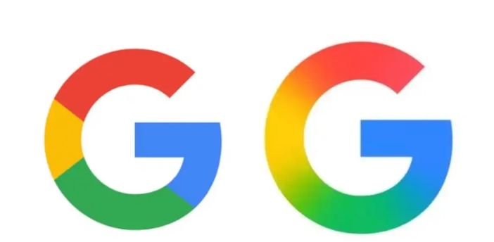
I can’t see the photo but the logo change was just a blend of the colors next to each other instead of lines. Old on left…
I wonder how much they paid their design team to use the surface blur tool on their logo lol
and to make people confused by using the almost same icon for every app they have
Yes, the app icons are horrible. You can’t “scan” them anymore at a glance. They all just look like exploded clown.
google blurring lines again.
so what’s new?
Google supports DEI!
/s
Huh. It’s just the Google icon, not Google home or Google Play or Gmail. I have a pixel.

Looks better tbh.

do you have one of these where the eyes fall out too
No, sorry. Best I can do is this:

thanky kind gas cloud
Bonus:

Didn’t even notice. Honestly, wouldn’t have noticed if it wasn’t pointed out for me.
I only noticed because I had to research Google and so I went to the Wikipedia page and it said “Logo since May 2025” and I was like “whaaaa 2015 was just months ago???” and i looked it up
you know what’s great about having an icon? BEING FUCKING ABLE TO FIND IT AND NOT GOING AAAAA WHERE’S MY FUCKING EMAIL ICON DON’T DO THIS TO ME AGAIN WAYLON
Will they change their business practices to respect their users’ privacy though?
Spoiler: they won’t - if they did they’d go bankrupt in a matter of months.


